Instagram Carousel Posts: The Complete Guide for 2026

An Instagram carousel post is a single feed post made up of multiple photos or videos that viewers swipe through. Instead of one image or one video, you get up to 20 slides that work together as a sequence: a hook, supporting points, and a payoff.
Carousels are one of the highest-performing organic formats on Instagram in 2026. They earn multiple impressions per viewer (Instagram can re-show a carousel with a different cover slide if the first one is skipped), they invite saves and shares, and they reward dwell time, which the algorithm reads as a quality signal.
This guide covers what an Instagram carousel is, the specs that matter, how many slides you should use, the formats that actually drive engagement, and a step-by-step workflow to publish your first one.
What Is an Instagram Carousel Post?
An Instagram carousel is a feed post that contains multiple photos, videos, or a mix of both, displayed as horizontally swipeable slides. Instagram's own help page describes the format as a way to share multiple photos or videos in a single post.
A few things define the format in 2026:
- Up to 20 slides per post (raised from 10 in 2023).
- Slides can be a mix of photos and short videos.
- Each slide shows the same caption, but viewers can stop on any slide.
- Carousels appear in the feed, the profile grid, the Explore tab, and Reels-style mixed surfaces depending on the content.
In plain terms: a carousel is a mini presentation packed inside one Instagram post.
| Term | Meaning |
|---|---|
| Carousel | A single Instagram post with multiple swipeable slides. |
| Slide | One image or video inside the carousel. Up to 20 per post. |
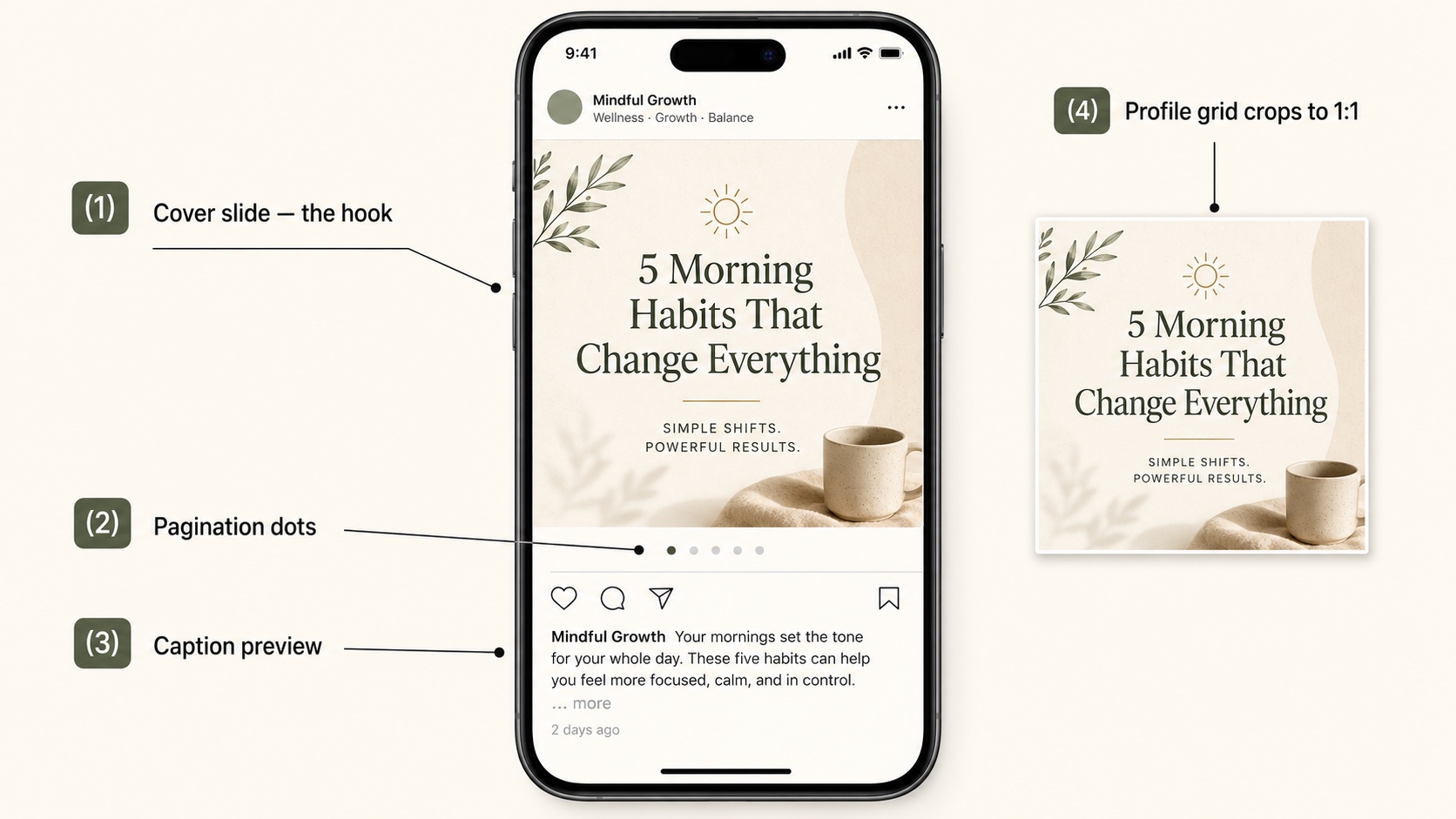
| Cover slide | The first slide. Acts as the hook in the feed and on the profile grid. |
| Seamless slides | Slides designed so the image continues across the swipe boundary. |
| Caption | The single text block shown under every slide. Up to 2,200 characters. |
Carousel vs Single Image vs Reel
The format you pick shapes how Instagram delivers your post and what viewers expect.
| Format | Best for | Trade-off |
|---|---|---|
| Single image | One clear visual, quote, or announcement. | Limited room to explain or persuade. |
| Reel | Motion, demonstrations, sound-led storytelling, reach. | Production-heavy. Sound and pacing carry the post. |
| Carousel post | Education, lists, comparisons, case studies, photo collections | Needs a strong slide sequence to hold attention. |
Use a carousel when one image cannot carry the idea, but you do not need motion or audio. Carousels are the format with the highest "attention per post" potential because every swipe is a small commitment from the viewer.
Instagram Carousel Specs in 2026
Getting the specs right is the difference between a sharp, click-worthy cover and a blurry, cropped one. Here are the numbers that matter.
Recommended Sizes
| Aspect ratio | Pixel size | Best for |
|---|---|---|
| 4:5 (portrait) | 1080 × 1350 px | Default. Highest engagement. Works everywhere. |
| 3:4 (tall, new) | 1080 × 1440 px | Long-form text, tutorials, fashion. Matches the profile grid ratio. |
| 1:1 (square) | 1080 × 1080 px | Cross-platform reuse, photo-heavy carousels. |
| 1.91:1 (landscape) | 1080 × 566 px | Rare. Use only if the source asset is landscape. |
Instagram added the 3:4 (1080 by 1440) option in 2026 as a third vertical format. 4:5 (1080 by 1350) is still the recommended preset and the engagement default. Keep every slide in a carousel at the same ratio: mixing ratios forces Instagram to crop or pad, and the result looks inconsistent in the feed.
File and Slide Limits
| Spec | Limit |
|---|---|
| Maximum slides | 20 per post |
| Minimum slides | 2 |
| Image file types | JPG, PNG |
| Video file types | MP4, MOV |
| Maximum image file size | 30 MB per image |
| Maximum video length | 60 seconds per slide |
| Maximum video file size | 4 GB per video slide |
| Caption | 2,200 characters, up to 30 hashtags |
For the full reference on dimensions, ratios, and safe zones, see the dedicated Instagram carousel size guide.
Safe Zones
Plan your slide layout with a 10 percent safe margin on every edge. Two reasons:
- The bottom 10 to 12 percent of the slide overlaps with the caption preview, the like and comment icons, and the page-indicator dots. Anything important there gets covered.
- The profile grid crops carousels to a square thumbnail. If your cover slide is 4:5 portrait, the top and bottom 13 percent get cropped on the grid view.
If your cover slide carries the hook, design two safe versions: one for the feed (4:5) and a center-safe version for the grid (1:1 crop).
How Many Slides Should an Instagram Carousel Have?
Instagram supports up to 20 slides, but more is not always better. Slide count is a function of the topic.
| Slide count | Best for |
|---|---|
| 3 to 5 | Quick tips, one-question Q&A, a single comparison. |
| 6 to 8 | Most educational and listicle carousels. The sweet spot. |
| 9 to 12 | Case studies, multi-step tutorials, deep dives. |
| 13 to 20 | Photo dumps, image-heavy storytelling, comprehensive checklists. |
For text-and-graphic carousels (the ones most creators publish), 7 to 10 slides is the engagement sweet spot. Long enough to deliver value, short enough that most readers swipe to the end.
Watch your completion rate in Instagram Insights. If most viewers stop swiping by slide 4, you are either burying the payoff or padding the middle.
Carousel Post Formats That Work in 2026
The Instagram SERP is full of generic "10 carousel ideas" lists. The formats below earn engagement consistently, organized by intent rather than by industry.
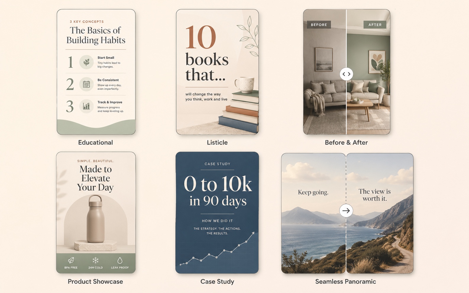
Educational Carousels
A short tutorial or framework, one step per slide. These earn the most saves because viewers want to come back and reference them.
Examples:
- "5 Lightroom presets that fix flat photos"
- "How to write a cold email that gets replies"
- "The 4 metrics every Shopify store should track"
Listicle Carousels
A numbered list, one item per slide. Easy to design, easy to consume, and they work for almost any niche.
Examples:
- "10 books that changed how I think about money"
- "7 ChatGPT prompts I use every week"
- "12 cafes in Lisbon that have wifi and outlets"
Before-and-After Carousels
Slide 1 is the "before" or the problem. Slides 2 onward show the transformation, with a closing slide that explains the method. Strong for fitness, design, renovation, and skincare niches.
Product Showcase Carousels
Slide 1 is a hero shot. Slides 2 to 5 show details, scale, use cases, and lifestyle context. Slide 6 closes with price or a link reference. Brands lean on this for product launches.
Case Study Carousels
Slide 1: a specific result ("How we grew this account from 0 to 10k in 90 days"). Slides 2 to 7: the steps. Final slide: the takeaway and CTA. These travel well on Instagram, LinkedIn, and X.
Storytelling and Narrative Carousels
A short essay broken into beats. Each slide carries one paragraph or one moment. Strong for personal brands and creators where the voice is the value.
Seamless Panoramic Carousels
A wide image split across multiple slides so the visual continues as you swipe. Designers and photographers use this for impact. The trade-off is design effort: you need a single panoramic image and slice software, and the format only works with 4 to 6 slides before the panorama becomes hard to read.
For more inspiration with screenshots, see the Instagram carousel examples guide.
Design Rules That Hold Attention
The first three slides decide whether the carousel works. Apply these rules in order.
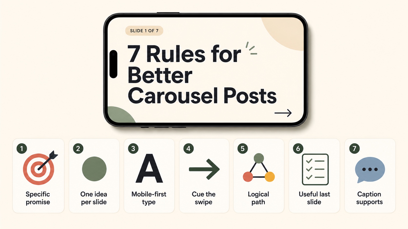
1. Make Slide 1 a Specific Promise
Generic covers ("My 5 tips for marketing") get skipped. Specific covers ("The 5 cold-email lines that doubled our reply rate") get tapped. Put the outcome on the cover, not the topic.
2. One Idea Per Slide
If a slide carries two ideas, split it. Two thin slides outperform one dense slide because the swipe rhythm stays steady.
3. Use Mobile-First Type Sizes
A safe minimum is 36 to 48 pixels for body text on a 1080-wide canvas. Headlines should be 60 pixels or larger. View every slide on a phone before publishing.
4. Cue the Next Swipe
A small "swipe" arrow, a numbered slide indicator (3/8), or a deliberate cliffhanger ("the next one is the most important") all keep viewers moving. Without a cue, completion drops sharply after slide 3.
5. Build a Logical Path
Each slide should answer the question the previous slide raised. If slide 4 jumps to a new sub-topic, you lose the swipe. Outline the carousel as a single argument, not a list of related thoughts.
6. Make the Last Slide Useful
The closing slide is where saves and shares happen. End with a checklist, a one-line summary, or a CTA. Do not waste it on "thanks for reading."
7. Caption Supports, It Does Not Repeat
The caption should give context the slides cannot: where the idea came from, why it matters, who it is for. If the caption summarizes the slides, viewers do not need to swipe.
How to Create an Instagram Carousel Post
You can create carousels inside the Instagram app, or design them externally and upload finished slides.
Option 1: Inside Instagram
- Open Instagram, tap the plus icon, choose Post.
- Tap the multi-select icon (overlapping squares) in the top-right of the gallery.
- Select up to 20 photos or videos. Order matters: tap them in the order you want them to appear.
- Apply edits per slide if needed. Filters can be set per slide or for all slides.
- Tap Next, write the caption, add hashtags, tag accounts, and add a location.
- Tap Share.
Option 2: Design Slides Externally
Most creators design slides in a tool first (Figma, Canva, Photoshop, or an AI carousel generator) and then upload finished images. This gives you full control over typography, layout, and brand consistency.
A typical workflow:
- Outline the carousel: cover, supporting slides, closing slide.
- Design at 1080 × 1350 pixels in your chosen tool.
- Export each slide as a JPG or PNG.
- AirDrop or upload the slides to your phone.
- Open Instagram, multi-select the slides in the right order, and publish.
Option 3: Generate Slides with AI
If you have the topic and the audience but not the design time, an AI carousel generator can turn a single prompt into a full set of branded slides. Then you upload the slides to Instagram the same way you would upload finished designs.
That is exactly what Insta Posts is built for: prompt to carousel in under 60 seconds, sized correctly for Instagram out of the box.
Common Instagram Carousel Mistakes
The mistakes below show up across almost every underperforming carousel.
| Mistake | Why it hurts | Fix |
|---|---|---|
| Vague cover slide | Viewers scroll past in under a second. | Promise a specific outcome on slide 1. |
| Mixed aspect ratios | Forces awkward crops and breaks visual rhythm. | Pick one ratio for the whole carousel. |
| Important text near the bottom | Caption and icons cover it. | Keep critical text inside a 10 percent safe margin. |
| Too many ideas per slide | Viewers stop swiping when slides feel dense. | One idea per slide. Split anything heavier. |
| Weak final slide | Saves and shares fall off. | Close with a checklist, summary, or CTA. |
| Caption repeats the slides | Viewers read the caption and skip the swipe. | Use the caption for context, not a summary. |
| Inconsistent slide design | Looks like five different posts stitched together. | Lock down type, color, and layout before designing. |
Are Instagram Carousels Still Relevant in 2026?
Yes. Three structural reasons keep carousels strong even as Reels dominate the platform's headline metrics:
- Multiple impressions per viewer. When a viewer skips a carousel without swiping, Instagram can re-show it later with a different cover slide. No other format gets a second chance like this.
- Save and share weight. Instagram's recommendation systems weight saves heavily. Carousels collect more saves than single images because they are reference-friendly.
- Dwell time. Each swipe adds seconds of attention. Even a 7-slide carousel can hold a viewer for 20 to 40 seconds, which is far higher than most single images.
The format only fails when creators treat it like a single post stretched across slides. Carousels reward sequence, and sequence requires planning.
Instagram Carousel FAQ
What is the carousel method on Instagram?
The "carousel method" is shorthand for using multi-slide posts as the primary feed format because they outperform single images on saves, shares, and dwell time. There is no official Instagram method, but creator coaches use the term to describe a content strategy built around carousels.
Is Instagram carousel 10 or 20?
20 in 2026. Instagram raised the limit from 10 to 20 in 2023 and has kept it since. You can still publish carousels with fewer than 10 slides; the change only raised the ceiling.
What is a seamless carousel on Instagram?
A seamless carousel is a single wide image split across multiple slides so that the image continues as you swipe. The visual reads as one panorama, broken by the swipe boundary. Designers use it for impact; it is more demanding than a normal carousel because every slice has to align perfectly.
Can you mix photos and videos in a carousel?
Yes. A single carousel can mix photos and short video clips in any order, up to 20 items total. Each video can be up to 60 seconds.
Do Instagram carousels still work in 2026?
Yes. Carousels remain one of the highest-engagement organic formats on Instagram because they earn multiple impressions per viewer, drive saves, and reward dwell time. Reels still dominate reach, but carousels dominate depth.
Next Steps
Once you understand the format, three follow-ups make sense:
- Get the exact specs and safe zones in the Instagram carousel size guide.
- Walk through a single tutorial in the step-by-step Instagram carousel post guide.
- Browse formats by use case in the Instagram carousel examples guide.
If you want to skip the design step entirely, you can generate a full Instagram carousel from a single prompt with Insta Posts. It returns slides already sized at 1080 × 1350 pixels, ready to upload.
Ready to create carousels with AI?
Turn any idea into a polished LinkedIn or Instagram carousel in under 60 seconds.